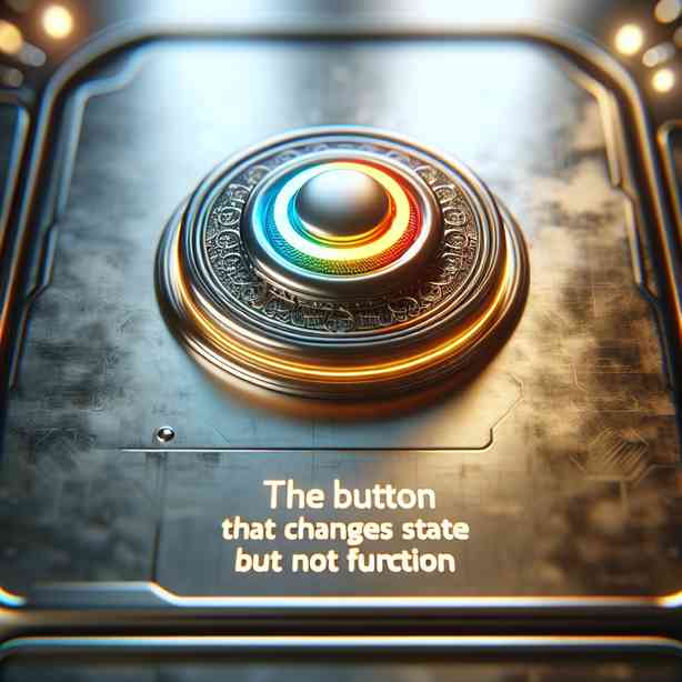
In the realm of user interface design, the concept of a button that changes state but not function plays a significant role in enhancing user experience. This idea revolves around buttons that may visually indicate a change, such as toggling between states, yet do not alter their fundamental functionality. Understanding how to effectively integrate such buttons into an application or website can lead to a more intuitive and engaging user experience.
At its core, the design of interactive elements like buttons is crucial. Buttons are often the primary means through which users interact with digital interfaces. When you think of a button that changes state, it’s essential to recognize that this might involve changes in color, shape, text, or icons. For instance, consider a play button that transitions into a pause button. Although the button visually changes, the functionality remains the same: it is simply a matter of perceiving the current action state more clearly.
A button that changes state can guide users through interactions without overwhelming them with too many options at once. This principle emphasizes the significance of simplicity and clarity in design. By keeping the core function constant, users can benefit from a visual cue that enhances their understanding of what their next action could be, thus reducing cognitive load. This seamless transition can be especially beneficial in applications where users need to maintain focus and reduce confusion over time.
One key aspect to consider when implementing such buttons is the feedback mechanism. Users should receive immediate feedback when they interact with a button. This feedback could be in the form of visual changes, sound effects, or even haptic responses in mobile applications. A button that changes state without changing function should still provide strong feedback, solidifying its purpose and encouraging further engagement from the user.
Moreover, utilizing color theory plays an integral role in the design of state-changing buttons. Colors can evoke emotions and convey meaning. For example, a button might change from green to red to signal a state change, indicating that it’s now inactive or that an action has been completed. The choice of colors should be consistent throughout the application, adhering to design guidelines to foster familiarity and ease of use.
Accessibility also must be considered when designing buttons that change state. It’s vital to ensure that users with varying abilities can easily identify and utilize these buttons. For example, colorblind users may not perceive changes in color but can still differentiate between visual shapes or textures. Thus, combining multiple visual indicators can enhance overall accessibility, ensuring that all users receive clear messages about the button’s state and function.
In addition to function and accessibility, the placement of buttons is another crucial factor. The position of a button within the interface can significantly influence user interaction. A well-placed button can reduce the distance a user has to travel with their cursor or finger, making it easier to click or tap when needed. The logical sequencing of button states also adds an additional layer of consideration – if a user toggles a button, they should expect that the following state will clearly represent the opposite action.
Data-driven design can provide insights into how users interact with buttons. By analyzing user behavior, designers can understand which type of feedback is most beneficial for the audience and how likely users are to discover and effectively use buttons that change state. Utilizing A/B testing can help determine the effectiveness of different design approaches, allowing for continuous refinement of the interface, leading to a more optimized user experience.
Another perspective on the buttons that change state but not function relates to branding and aesthetics. Many companies utilize custom button designs that are visually appealing and harmonize with their brand identity. The design of state-changing buttons should adhere to the overall visual style of the application or website, ensuring continuity that strengthens brand recognition. However, designers must strike a balance between creativity and functional design, ensuring that aesthetic choices do not interfere with usability.
Also, consider the emotional aspect of button design. Users often form emotional connections with digital interfaces. An interface that feels responsive and rewards user interactions encourages a positive emotional response. A button that changes state while preserving its function contributes to this relationship by providing a clear indication that their actions are recognized and valued within the interaction.
Finally, performance considerations must not be overlooked. Buttons need to respond swiftly to user interactions. If a button that changes state does not perform adequately, it can lead to frustration and disengagement. Ensuring that buttons are optimized for performance, with minimal loading times and efficient transitions, is crucial for maintaining user interest and satisfaction.
In conclusion, the design and implementation of buttons that change state without altering functionality are vital in contemporary user interfaces. They provide clarity, enhance user engagement, and improve accessibility, while also aligning with branding and performance standards. By investing time and resources into researching user preferences and behavior, designers can create intuitive and attractive interfaces that cater to the needs of all users. Understanding the profound impact that these buttons can have on user experience is essential for any successful design project, and by prioritizing user interaction, businesses can foster a more enjoyable and productive environment for their users.