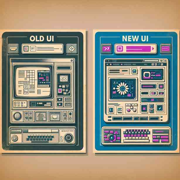
The user interface (UI) plays a crucial role in how we interact with software and applications. Recently, many platforms have gone through redesigns that promise a “new UI.” However, upon closer inspection, some users have noted that these new designs seem eerily familiar, resembling their predecessors much more than expected. This phenomenon can be attributed to several factors that we will explore, shedding light on why the “new UI” looks like the old one.
First and foremost, it is essential to understand that user experience (UX) is paramount in design. When a company embarks on a redesign, they usually invest significant time and resources into understanding how users interact with their platforms. This research often reveals that certain elements of the original design are extremely effective, intuitive, and beloved by users. Consequently, designers may choose to retain these elements in the new UI to preserve the familiar feel that users have grown accustomed to.
Additionally, there is a strong desire for continuity in UI design. Users generally do not like abrupt changes that could disrupt their workflow. A sudden overhaul can lead to frustration, confusion, and a steep learning curve. As a result, designers often adopt a gradual evolution approach rather than a complete revolution. The goal is to introduce new features and enhancements while still maintaining enough familiarity so that users can transition smoothly.
Another factor influencing the appearance of new UIs is brand consistency. Companies often strive to create a cohesive brand identity across all their products and platforms. If a UI change diverges too far from existing brand standards, it can undermine the overall image and message the company aims to project. Therefore, many “new UIs” are subtly revised versions of their predecessors, incorporating updated design trends while aligning with established brand guidelines. This balancing act ensures that the new design feels fresh yet recognizable.
Moreover, technological advancements play a role in the design landscape. As software platforms adapt to accommodate new technologies, certain design elements may naturally carry over. For example, the rise of responsive design means that UIs must remain functional across a variety of devices and screen sizes. This often requires reusing existing design patterns, making it appear that the new interface mirrors the old one, even if it has been optimized for modern requirements.
Considering these factors, it becomes clear why redesigns may lead to user interfaces that look strikingly similar to their predecessors. However, there is often more going on beneath the surface than mere aesthetics. Many redesigns include significant improvements in functionality, speed, and accessibility that enhance the user experience, even if those changes are not immediately visible.
Furthermore, user feedback is a vital component in the redesign process. Before implementing a new UI, companies often conduct user testing with prototypes to gather insights on how the changes will impact daily usage. This testing can lead to the conclusion that certain elements of the old UI should be retained to ensure usability is not compromised. The result is a final product that, while boasting a new look, also incorporates familiar elements that users appreciate.
In addition to user testing, the influence of competitor analysis cannot be overlooked. Companies often observe trends in the industry and the designs of competing platforms. If a particular design element is gaining traction among competitors, it is tempting for a company to incorporate a similar approach to remain relevant and competitive. This mirroring effect can lead to UIs looking alike, creating a landscape where change does occur, but it may not be as radical as some users might expect.
Let us also consider the psychological aspect of familiarity. Psychologically, humans tend to gravitate toward familiar experiences, finding comfort in consistency. When a new design retains aspects of the old UI, it can evoke a sense of trust and reliability. Users are less likely to resist a design they recognize, reducing the cognitive load associated with adapting to the new interface.
As we examine these various pressures and influences, it is essential to acknowledge that while the “new UI” may look similar to the old one, it signifies growth and adaptation rather than stagnation. Every update aims to improve the user experience, ensuring that changes cater to both new and existing users’ needs.
In conclusion, the intriguing phenomenon of the “new UI” resembling the old one is a nuanced issue embedded in user experience principles, brand identity, technological evolution, user preferences, and market dynamics. Understanding this context can illuminate the reasons behind design choices and show that while the visual aspects may not drastically change, the underlying improvements often result in a better, more intuitive, and user-centered interface. As technology continues to evolve and user expectations shift, future UI designs may surprise us, but they will likely keep an eye on familiar elements that keep users comfortable and engaged in their digital experiences.