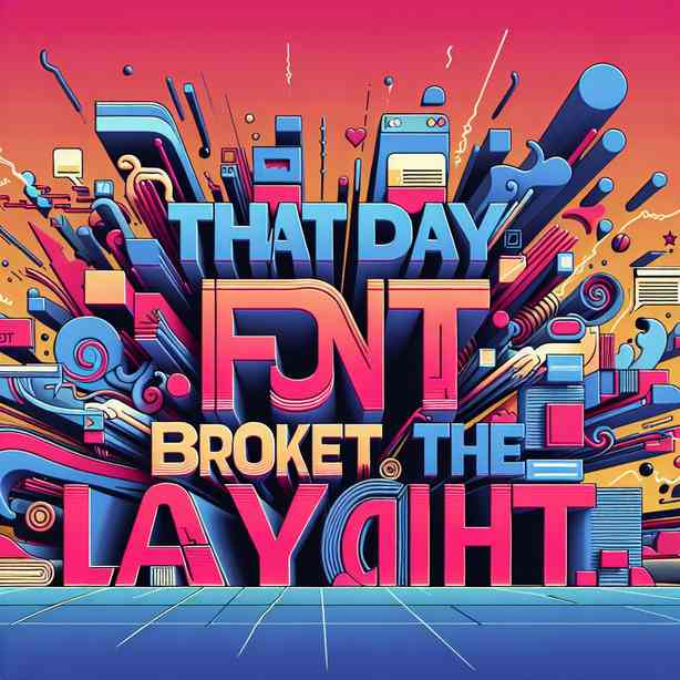
In the world of web design and typography, the interplay between fonts and layouts is a critical aspect that can affect the overall user experience and aesthetic appeal of a website. The story of how a particular day led to a crisis in design—dubbed “That Day the Font Broke the Layout”—serves as an important cautionary tale for designers and developers alike. This narrative exemplifies the significance of cohesive design practices and attention to detail, as well as the potential pitfalls that can occur when these principles are overlooked.
To set the scene, we must first consider the various elements that comprise a website’s design framework. Fonts serve as not only a means of communication but also as a vehicle for conveying a brand’s personality. Selecting the right typeface can significantly enhance user engagement by setting the tone and establishing an emotional connection. However, this connection can swiftly unravel if the chosen font does not integrate well with the layout, leading to disarray and confusion, as was the case on that fateful day.
One of the primary triggers for this dilemma was the adoption of a new typeface that promised modernity and versatility. The design team, eager to embrace innovation, decided to implement this font across their existing layouts without conducting thorough testing. This decision, whether rooted in excitement or oversight, lacked the essential foresight that is vital when updating design elements. The team did not account for how the new font’s metrics—such as its height, width, and kerning—might interact with the established grid system of the layout. When the typeface was finally applied, the results were nothing short of catastrophic; content began to overlap, margins were skewed, and the user interface became an unrecognizable labyrinth.
As this disarray became apparent, it triggered urgent discussions among team members. The designers recognized that a font, when improperly paired with a layout, could lead to unintended consequences, such as diminished readability and user frustration. It’s essential to understand that typography is not just about aesthetics; it plays a fundamental role in user experience. Research shows that poor typography can lead to a loss of engagement, as users become disoriented by unreadable text and confusing layouts.
To address the crisis, the team approached the issue with a collaborative mindset. They initiated a series of brainstorming sessions aimed at identifying the root causes of the layout failures. Here, the importance of cross-disciplinary collaboration became evident. Designers, developers, and content strategists came together to analyze the inconsistencies and propose solutions. Throughout these discussions, it became clear that a strong foundation in typography principles was essential. The team revisited fundamental concepts such as hierarchy, contrast, and alignment, ensuring that they could apply these principles effectively moving forward.
After thorough deliberation, the team decided to revert to the previous font while also conducting comprehensive A/B testing with potential replacements. This decision exemplified a commitment to iterative design—a process that embraces trial and error, thereby creating opportunities for learning and growth. By comparing user feedback and engagement metrics, the team could make informed choices about typography that would enhance the user experience rather than hinder it.
Through this experience, the design team also learned the significance of documenting their processes and decisions. By creating a style guide that outlined font choices, use cases, and design principles, they developed a valuable resource for both current and future projects. This guide served not only as a reference point but also as a toolkit designed to foster alignment and clarity among all team members. Moreover, it highlighted the importance of consistency in typography across various platforms and devices, emphasizing that what looks good on desktop might differ significantly on mobile.
Ultimately, the crisis of “That Day the Font Broke the Layout” yielded fruitful lessons. The team emerged with a renewed understanding of the intricacies of typography and layout, fostering a culture of careful consideration and respect for design fundamentals. They recognized that effective design is not simply about aesthetics; it’s about creating a harmonious experience that resonates with users.
Today, as web design continues to evolve with auto-adjusting layouts and responsive design becoming the norm, it remains paramount for designers to remain vigilant about their typography practices. Advanced tools and software can automate much of the layout process, but they also risk introducing unforeseen issues if not carefully monitored. Therefore, designers must strike a balance between technological efficiency and the human element of design—a harmony that ensures that typography serves its rightful role as a bridge between content and audience.
Moreover, regular audits of typography across existing projects can prevent future missteps. Organizations should prioritize ongoing education in design practices, encouraging team members to stay informed about the latest trends and tools in typography. By investing in workshops or online courses, teams can cultivate a culture of continuous learning, which ultimately translates into higher-quality designs.
In conclusion, “That Day the Font Broke the Layout” serves as a poignant reminder of the complexities inherent in web design. It underscores the need for thoughtful integration of typography with layouts, calls for collaborative problem-solving, and highlights the importance of documentation and consistent practices. As we advance in the digital landscape, let us remember that effective design hinges on the tiniest details, for it is often these details that make the most significant impact on user experience. Font choices may seem like minor decisions, but they can profoundly shape the way audiences interact with content. By valuing typography as an integral part of web design, we can enhance engagement, facilitate communication, and ultimately create a more inviting digital environment for all users.
In shaping these lessons into actionable practices, we not only avoid potential pitfalls but also elevate the standards of our design work. Whether you are a seasoned designer or new to the field, always approach typography with care and intent. Remember, a well-chosen font does more than just display text; it has the power to elevate your layout, convey your message clearly, and resonate with your audience on a deeper level. With this understanding, let us forge ahead with design practices that honor the intricate dance between typography and layout, ensuring our creations are as effective as they are beautiful.